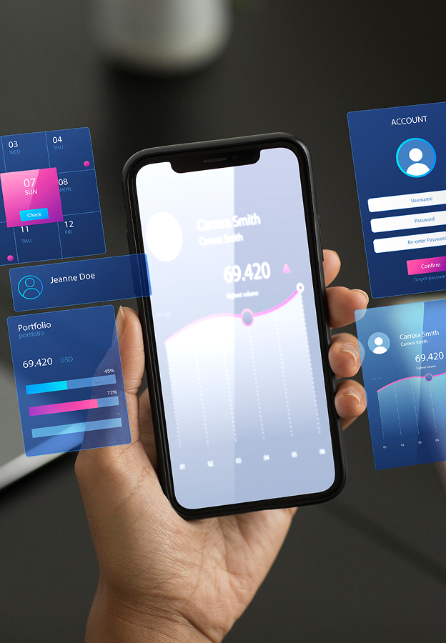
Mobile UI/UX Design
49
6+


In a mobile-first world, intuitive and visually appealing mobile UI/UX design is critical to capturing user attention and driving engagement. Designing for mobile devices requires a deep understanding of user behavior, screen size limitations, and touch-based navigation. By focusing on clarity, functionality, and aesthetics, great mobile UI/UX ensures a seamless and enjoyable experience for users on the go.
Challenges
Small Screen Usability
Designing for limited screen real estate demands a focus on simplicity and clarity to avoid overwhelming users.
Touch Navigation
Mobile interfaces need to account for intuitive gestures and easy-to-tap elements for smooth interaction.
Consistency Across Devices
Ensuring a cohesive experience between mobile and desktop interfaces builds trust and user loyalty.
Design Solutions Tailored for Mobile Devices
User-Friendly Layouts
We create clean and focused designs that optimize every pixel of your mobile interface.
Gesture-Based Navigation
Our designs incorporate intuitive gestures, such as swipes and taps, to enhance usability.
Adaptive Design
Ensure your mobile interface adapts seamlessly to different screen sizes and orientations.

Why Choose Crebos for Mobile UI/UX Design
- Intuitive designs that prioritize user satisfaction and engagement.
- Seamless navigation tailored specifically for touch-based interactions.
- Responsive layouts that adapt to various devices and screen sizes.
- Aesthetically pleasing interfaces that elevate your brand on mobile platforms.


Download our free Digital Business card app to save and collect your Business Contacts
 LinkedIn